It was attached to his original templates
| Attachments: |
|
DSC_0716.JPG [ 1.51 MiB | Viewed 17445 times ] |
| The Aliens Legacy http://forum.alienslegacy.com/ |
|
| Armour colours http://forum.alienslegacy.com/viewtopic.php?f=3&t=15397 |
Page 1 of 4 |
| Author: | skapunkninja [ Sat Apr 25, 2015 12:47 pm ] |
| Post subject: | Armour colours |
On a recent trip down to Terrys he showed me his original colour chart/pallet for painting the armour. It's completely different from the colours that we consider correct, so now I'm torn as to which set to use! Does anyone have a side by side comparison of a TE set, and a fan painted set? |
|
| Author: | Harry Harris [ Sat Apr 25, 2015 1:21 pm ] |
| Post subject: | |
Rich are you sure the chart featured the original (1985) colours? I know that Terry had the original Humbrol paints colour-matched at one point, around the 1990's if I recall correctly. I think just so that he could have bulk quantities of the paint, but the colour matching wasn't that accurate. Harry |
|
| Author: | nocternus [ Sat Apr 25, 2015 2:20 pm ] |
| Post subject: | |
Personally i would use colours that look like the armour seen in your eyes |
|
| Author: | skapunkninja [ Sat Apr 25, 2015 3:05 pm ] |
| Post subject: | |
It was a piece of metal with all the colours painted on and a Humbrol Colour and code written next to it. He said it was what he originally used as a record of what paints he used. I just thought it would be interesting to see the differences |
|
| Author: | Harry Harris [ Sat Apr 25, 2015 3:19 pm ] |
| Post subject: | |
Awesome, I didn't know he had that; and I expect Terry had forgotten too bless 'im! If you could post a photo of it up on here that would be great, I have some photos of armour painted with the colour-matched paints which I'll dig out later tonight once I get home from work. EDIT: I had a quick browse around the Web and realised that there are quite a few images of armour which once belonged to our very own Friendlyskies (I'm not sure who owns this now) but I'm pretty sure it was painted in the colour-matched (i.e. not Humbrol at all) paint colours here on the colonialmarines.co.uk website. Darren can you confirm this at all? Harry |
|
| Author: | skapunkninja [ Sat Apr 25, 2015 6:52 pm ] | ||
| Post subject: | |||
It was attached to his original templates
|
|||
| Author: | tacblue [ Sun Apr 26, 2015 12:58 am ] |
| Post subject: | |
Extremely interesting, though quite bizzare... almost none of those look quite right.... might give it a shot though... |
|
| Author: | Chef [ Sun Apr 26, 2015 10:05 am ] |
| Post subject: | |
The 91 and 160 aren't a surprise. 91 we know. That's Matt Black Green 160 is Matt German Red Brown and has been mooted as a colour before. 64 Light Grey I've tried on a swatch and it seemed a bit dark. The 29 Dark Earth and 226 Interior Green are new to me, and I haven't even considered them because from the tin lids they look NOTHING like what Terry's got on his swatches. The lighter of the two greens has always bothered me a bit as the ones I had never quite seemed right. This may be the key. I've known for a while never to trust the paint lid tins for an exact colour match. Here's my tin selection. (you can probably see some difference in the colours as I painted the lids as comparison)  and some swatch testing.  And here's Harry's Armour set against one of mine. (Mine on the left).  Well... Off to the Model Shop it is then! |
|
| Author: | ObiHahn [ Sun Apr 26, 2015 10:15 am ] |
| Post subject: | |
Again, the plot thickens - and the search never ends. To my eye, many of the recent Terry English paintjobs look a bit off to me and compared to what can be seen on Harry's Hudson armour... interesting! |
|
| Author: | Harry Harris [ Sun Apr 26, 2015 5:32 pm ] |
| Post subject: | |
I had a dig around and found some photos that I took in 2002 when a friend commissioned Terry to make him a set of armour. It was painted with the colour matched paints that I mentioned above. This is the set that Terry built and painted: Attachment: Repro set with colour matched paint.jpg [ 695.41 KiB | Viewed 17366 times ] Attachment: Repro set with colour matched paint 3-4 view.jpg [ 647.86 KiB | Viewed 17366 times ] And here's Terry painting the helmet from the set. Note the large can of colour-matched paint on the bench. Attachment: Terry using colour matched paint.jpg [ 1.32 MiB | Viewed 17366 times ] Lastly this is a close-up of the left shoulder, with Rich's photo of Terry's colour swatch next to it. Attachment: Comparison.jpg [ 1.02 MiB | Viewed 17366 times ] Now while it's not a 100% match, most likely due to the photos being taken with different cameras (Rich was the photo of the swatch taken on a phone?) and under different lighting conditions etc. I'm going to say that I'm fairly sure that at least some of the colours on the swatch are the same as those used on that armour - i.e. the colour-matched ones. Harry |
|
| Author: | tacblue [ Thu Apr 30, 2015 1:10 am ] |
| Post subject: | |
Shall I beat the dead horse? Sighhh...while it's nice to have an "official" list from the Creator, unfortunately that 226 Green doesn't appear to exhibit any of the characteristics of the green used on your Hudson set Harry. Different camera and lighting notwithstanding... your set has always exhibited a blueish-green hue when photographed, as seen in Chef's pic above and the many, many pics from various events and displays. This hue remains pretty consistent across all the various pictures. It is also present in Propstore photos of Apone's armor and the recent "Hicks" photos using Wierzbowski's/Hicks's armor. I've tried 226 on an aluminum plate at home, along side 78 (i think it was) and 101, and 120. Thus far 78, as first put forward by Mirax/Starwarschick has that same sort of tone when photographed but looks similar to 226 after weathering. I need to get an explanatory pic of my swatch back on my phone... I cleared all my pics off before going to Celebration Anaheim... I wonder if Humbrol might not have switched around the color code numbers at some point since the 80's... |
|
| Author: | Willie Goldman [ Fri May 01, 2015 4:12 am ] |
| Post subject: | Re: Armour colours |
Shame the color of these photos isn't ideal: 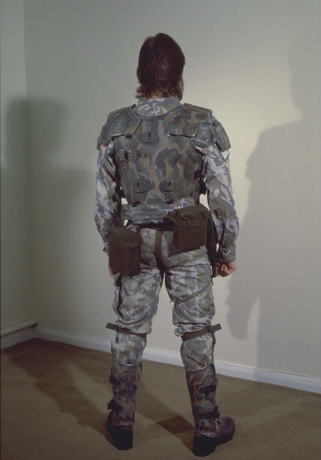 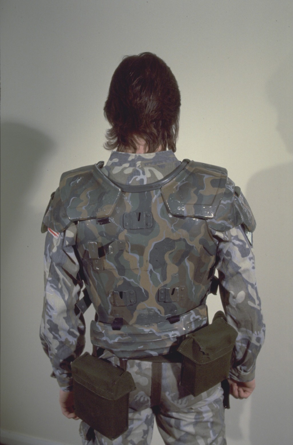 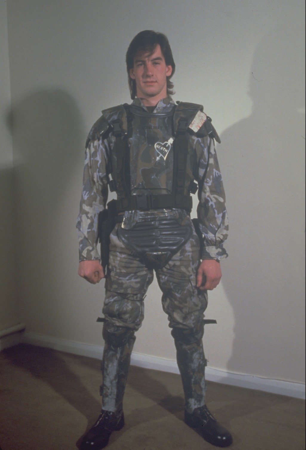 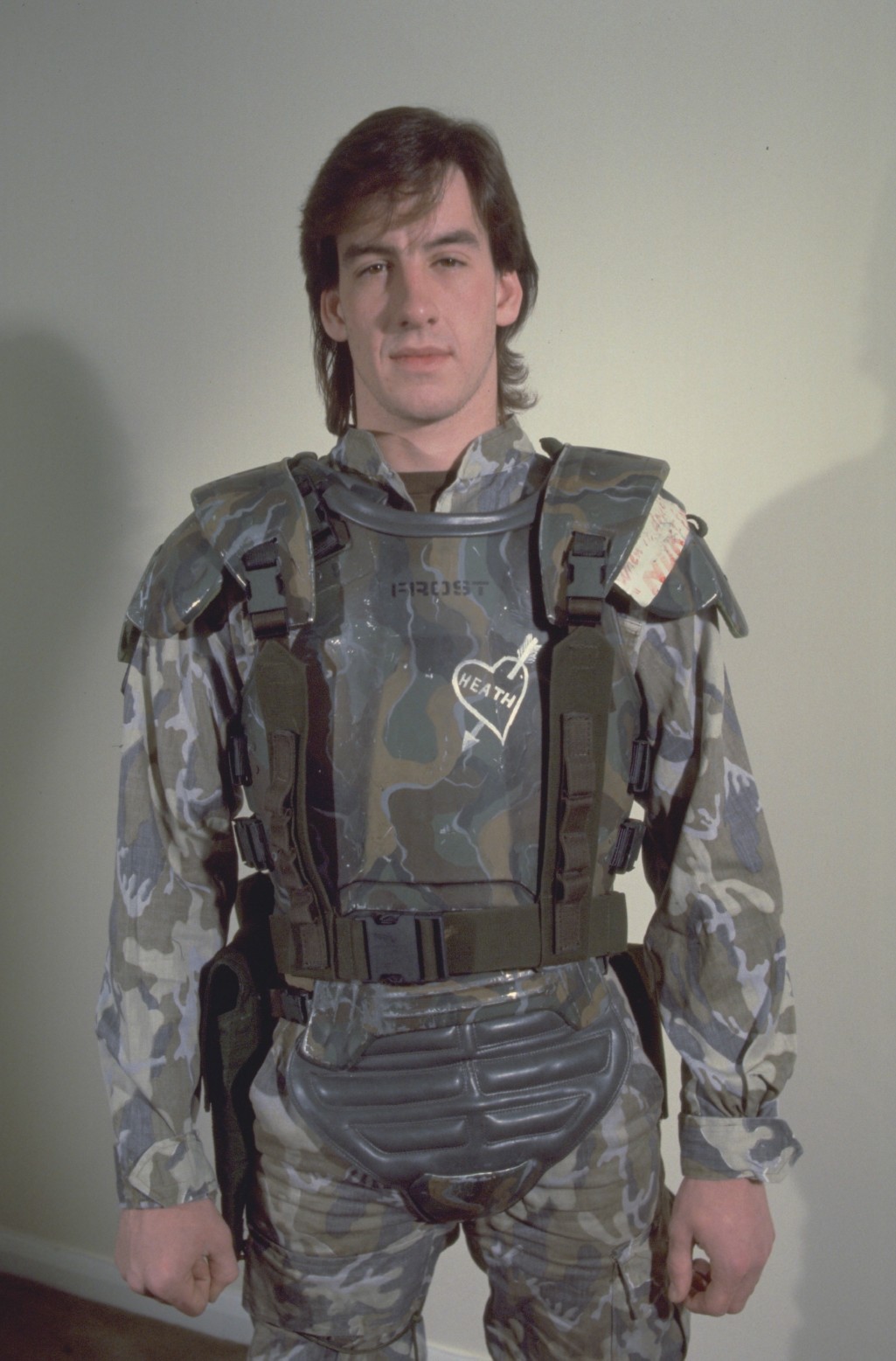 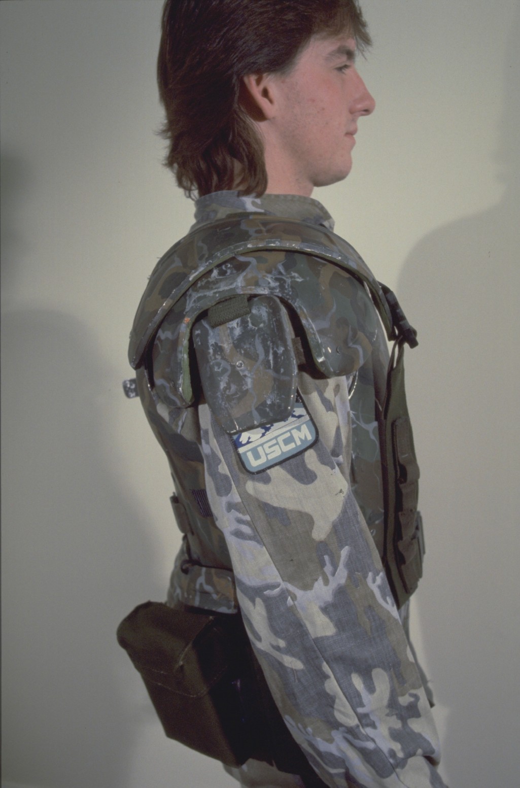 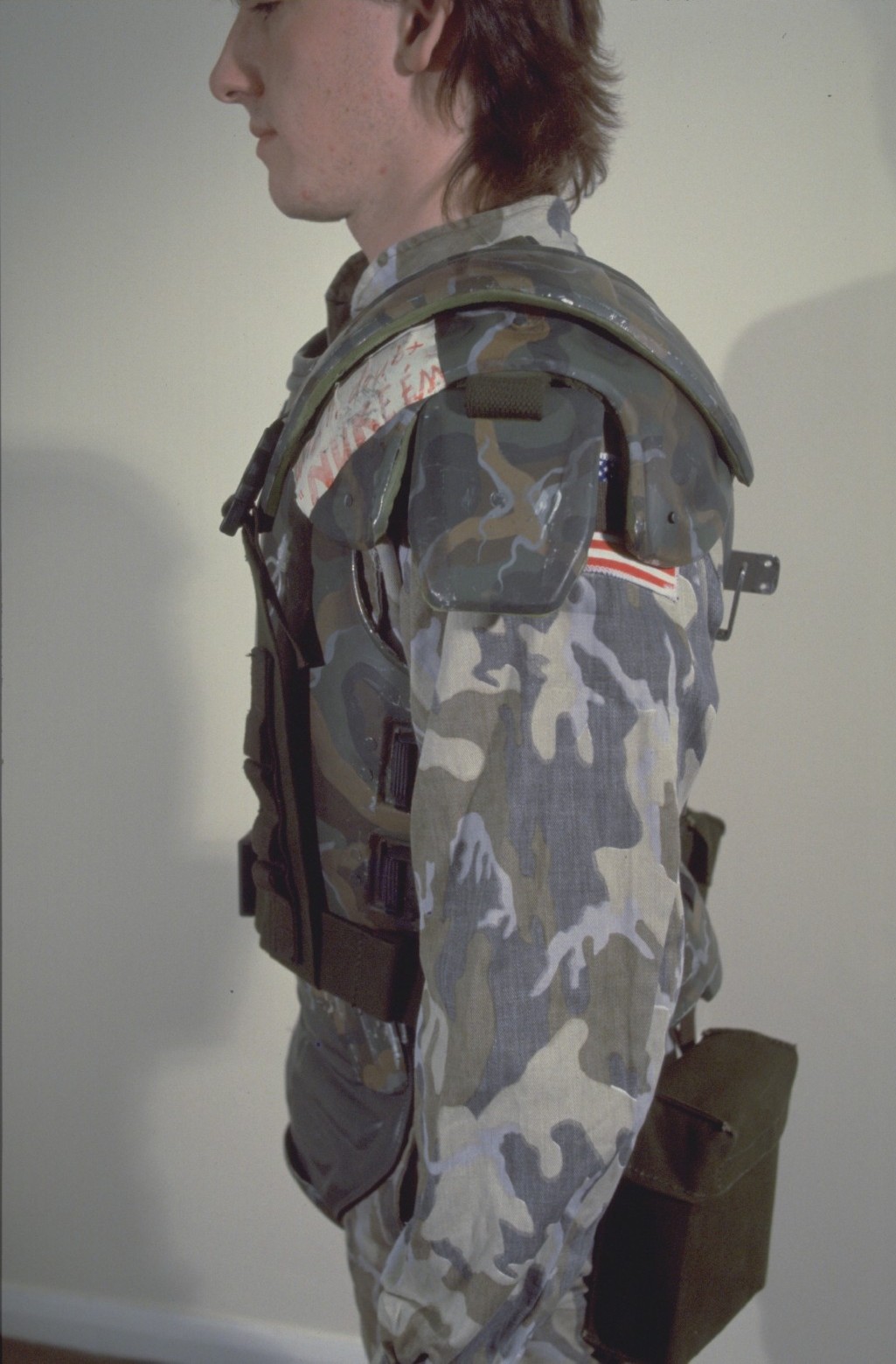 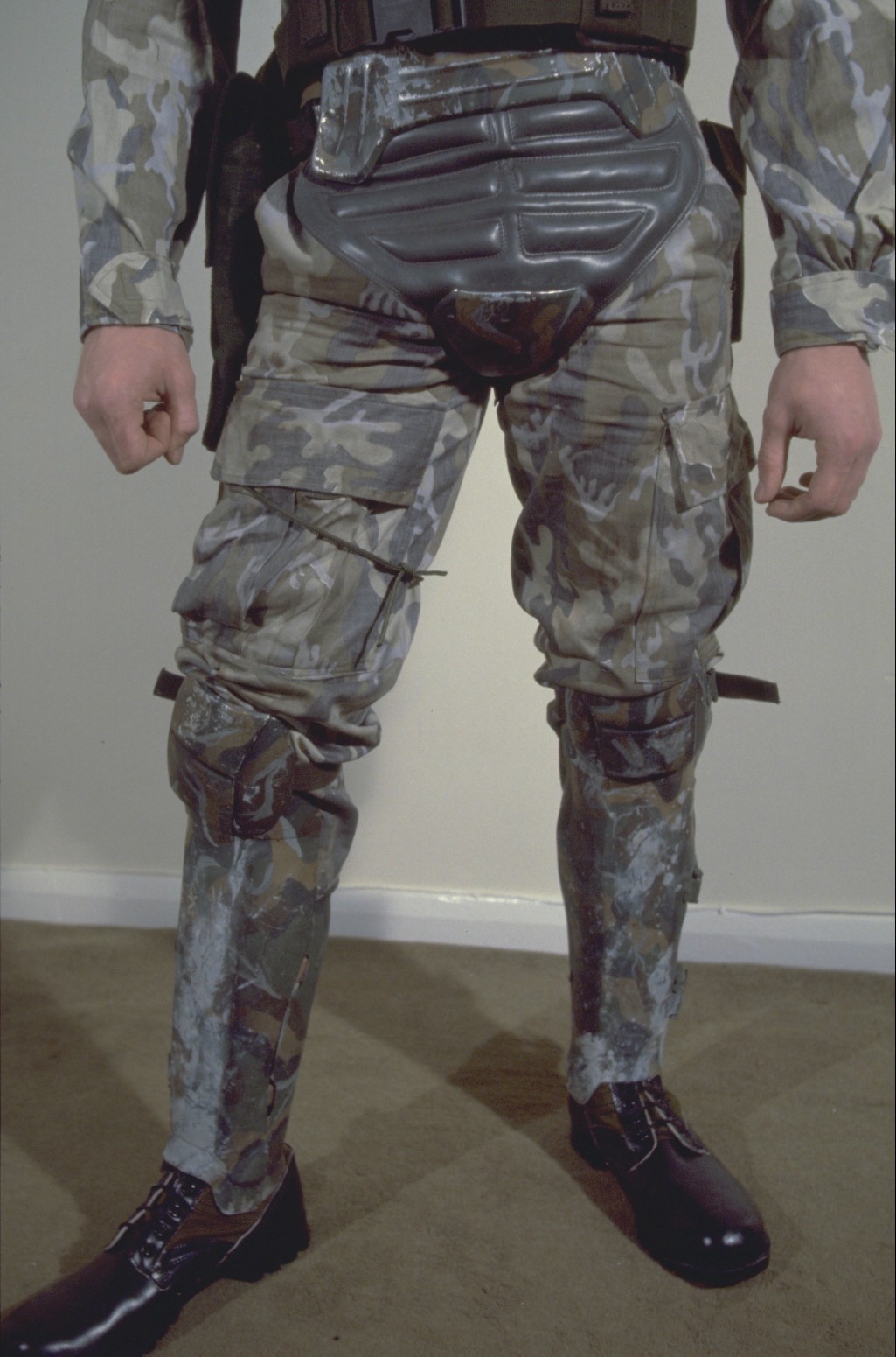
|
|
| Author: | Moosh89 [ Fri May 01, 2015 6:56 am ] |
| Post subject: | |
Thanks Willie for posting those photos up again. I bet with a little tinkering in Photoshop, we can get the colour closer to what would be seen with a naked eye. We know the correct colour of the BDUs, patches and the green bags, so it shouldn't be too hard. I want to give it a try so I will post back with my results. Edit* Just played with one photo for tonight. I tried my best to play with the photo of TEs swatch board as well. I could get #s 29, 91 and 64 to match pretty good but that 160 and 226 would not co-operate... They do seem really off. With saying that, 29, 160 and 226 on his board look nothing like the swatches found online. No matter how much photoshop sorcery... Anyway, attaching my results... I tried to keep an eye on the green of the grenade straps and holster, as well as skin and hair tones, the wall behind him and the BDUs. We probably don't know what condition the master photos were in when they made the transition to digital either. Attachment: armor16medium edited.jpg [ 103.34 KiB | Viewed 17203 times ] Attachment: Web swatches.jpg [ 37.24 KiB | Viewed 17203 times ] |
|
| Author: | tacblue [ Fri May 01, 2015 8:35 am ] | |||
| Post subject: | ||||
Here's a couple quick snaps as I was leaving for work. So far I'm leaning towards 76. Half the 76 has a light coating of grate polish as you can see. The helmet is 76 with various experimental colors, with weathering.
|
||||
| Author: | jayw1235 [ Fri May 01, 2015 10:27 am ] | |||||
| Post subject: | Painting | |||||
Hi guys, not sure if this helps but i was at Terry's yesterday and we were talking through painting the Armour as i got mine unpainted. Anyway i have taken some more pics of his colour chart for everyone for reference. Now he showed me that to darken down the armour he wipes on then wipes off Reeves raw umber acrylic paint and that brings a closer match to the original colours, we even put a little on his chart and compared it to one of the original throat guards he made for the film and it comes up very very close! Hope this helps a little
|
||||||
| Author: | tacblue [ Fri May 01, 2015 11:28 am ] |
| Post subject: | |
Not sure why but I wasn't able to add the 3rd pic to my previous post.. I can add pics of the helmet, but for some reason not of the color palette, though I took them at the same time... anyone know why that might be? This ia bizarre... |
|
| Author: | tacblue [ Sat May 02, 2015 12:41 am ] | ||
| Post subject: | |||
Here is the palette... for whatever reason I was only able to attach the one pic, but at least I got SOMETHING up... The 226 is that little bit of paint that looks like a pickle among the greens. Totally off to the movie sets, to my eye anyway. But certainly dead on to his current repros...
|
|||
| Author: | Bug Stomper [ Sat May 02, 2015 3:56 am ] |
| Post subject: | Re: Armour colours |
Judging from the pictures it looks like the Humbrol 226 is a good match to the armor Terry had for sale at the London Film and Comic Con in 2004: Attachment: IMG_0804s.jpg [ 174.42 KiB | Viewed 17132 times ] However, the color didn't match up with his "movie aera" stuff: Hudson Proto: Attachment: IMG_0799s.jpg [ 193.86 KiB | Viewed 17132 times ] Half scale Proto: Attachment: IMG_0803s.jpg [ 176.26 KiB | Viewed 17132 times ] All the above photos were taken with the same camera at Terry's booth. Cheers, Stefan |
|
| Author: | nick-a-tron [ Sat May 02, 2015 1:46 pm ] |
| Post subject: | |
Sidenote: Anyone notice the dark (grate polish) weathering around but not actually on the front panel of the screen used chest plates? Maybe for forced perspective? |
|
| Author: | Moloch [ Sat May 02, 2015 3:32 pm ] |
| Post subject: | Re: |
nick-a-tron wrote: Sidenote: Anyone notice the dark (grate polish) weathering around but not actually on the front panel of the screen used chest plates? Maybe for forced perspective? Very iteresting observation ! |
|
| Author: | retrogarde [ Sat May 02, 2015 5:26 pm ] |
| Post subject: | |
There's a French term for that, tromp l'iel or something (excuse my poor French!!). It is more noticable in Moosh's awesome color corrected version. |
|
| Author: | tacblue [ Sun May 03, 2015 4:54 am ] |
| Post subject: | Re: Re: |
Moloch wrote: nick-a-tron wrote: Sidenote: Anyone notice the dark (grate polish) weathering around but not actually on the front panel of the screen used chest plates? Maybe for forced perspective? Very iteresting observation ! My guess is that the weathering just got worn off. With the grate polish I used, I find that I can wipe it off even days later, leaving the colors almost back to their original brightness. Maybe the front and back plates were subject to more handling/rubbing than other parts? Don't know if the weathering on the originals was sealed or not... |
|
| Author: | nick-a-tron [ Sun May 03, 2015 7:06 pm ] |
| Post subject: | |
Its a very specific place to just get worn off, especially as theres no other wear under straps etc. |
|
| Author: | Moosh89 [ Sun May 03, 2015 9:03 pm ] |
| Post subject: | |
It could be the flash of the camera too because the front panel would be closest and be the most illuminated |
|
| Author: | Willie Goldman [ Mon May 04, 2015 1:02 am ] |
| Post subject: | |
FWIW:  http://www.propstore.com/content/collec ... s/img1.jpg http://www.propstore.com/content/collec ... s/img2.jpg 
|
|
| Page 1 of 4 | All times are UTC [ DST ] |
| Powered by phpBB © 2000, 2002, 2005, 2007 phpBB Group http://www.phpbb.com/ |
|